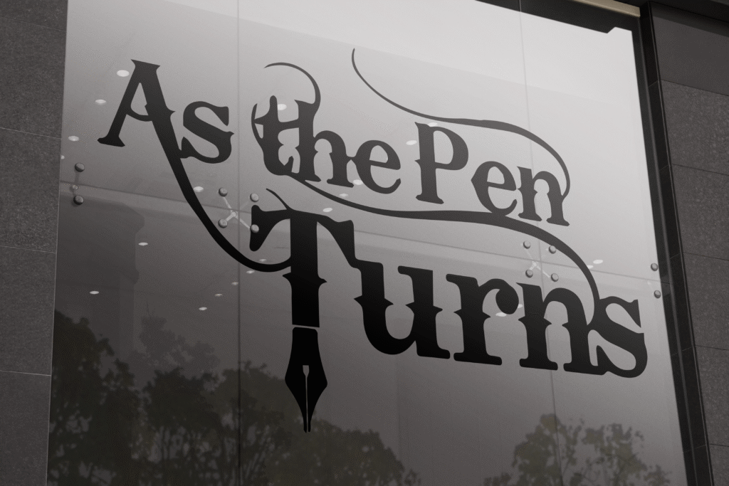
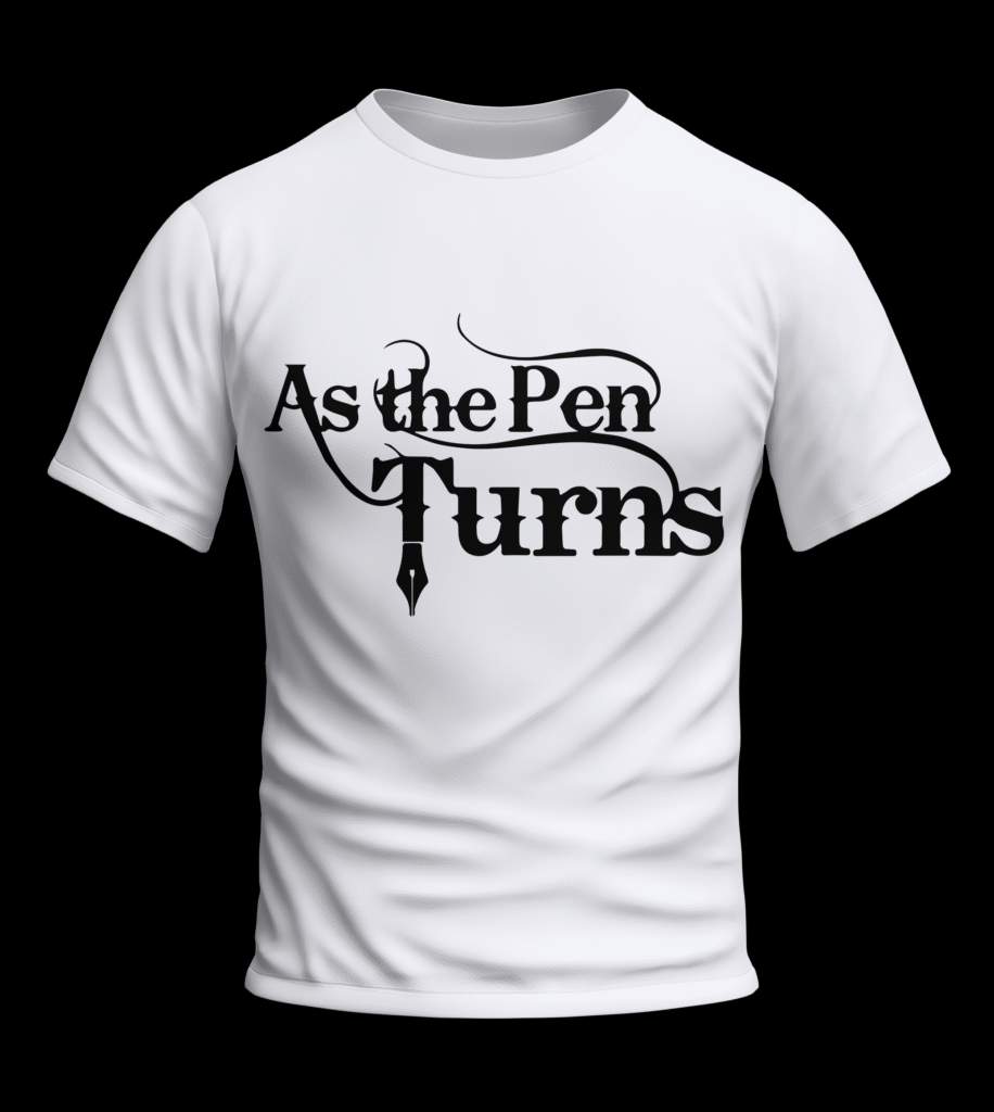
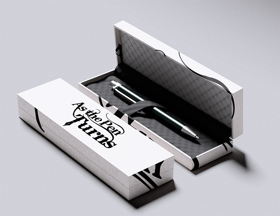
As The Pen Turns, a podcast created by custom pen makers, needed a cohesive brand identity that captured the craft, personality, and storytelling at the heart of the show. The founders envisioned a logo that used only black to reflect the precision, craftsmanship, and minimal tools involved in pen making.
Approach
I designed a minimalist logo inspired by the physical act of pen turning, using carved away shapes to reflect material being shaped on a lathe.
From this concept, I built a branding foundation that balanced craftsmanship with modern simplicity, creating a visual language the client could
apply across future digital, print, and product touchpoints.
Outcome
The new identity gave the podcast its first cohesive brand presence rooted in the essence of pen making.
It established a professional visual direction that the founders could confidently use as they expanded their product line and audience.